Target Self-Checkout Store Experience
In 2016, I was part of a small team of Target creatives that was asked to concept and design a user experience for a prototype hybrid self-checkout fixture to revolutionize the guest checkout experience and ease friction points that existed in the system.
The core idea of the experience was to combine the store mode with the self-checkout mode into an all-in-one convertible fixture that Target team members could change efficiently when needed. With that goal in mind, we created an entirely new UX & UI experience for guests and team members that was more intuitive, user-friendly, and branded.
Ultimately, the scope and scale of the hardware proved to be too cost-prohibitive to implement, but the design of the self-checkout experience proved to be so successful that it was implemented across the entire self-checkout system and remained the core experience for several years.
Responsibilities:
Experience Design
Iconography
Illustration

During the process of testing this experience, one of the most fascinating and thrilling aspects was observing a real guest’s candid interaction with the interface from a distance. You quickly understand the limits of your design when it’s put to the test of checking out a guest smoothly and efficiently.
Upon initiating a session, the guests were greeted with a start screen that presented a simple set of functions to begin the checkout experience. The most important being the CTA to begin scanning products.
The primary scanning interface was designed to provide the user with the most important information in an organized structure. The user could see an item and price as it was scanned and was shown the subtotal and any discounts or promotions that were applied.
Looking up a grocery item brought the user to a quick, intuitive scrolling menu with the most popular produce items to choose from. When Target Wallet was introduced as a method of payment, it was promoted in the experience with a lightweight coach mark. One of my favorite aspects of this interface was that, for most sessions, you only needed to touch the screen one time if you were using Wallet to complete your transaction.
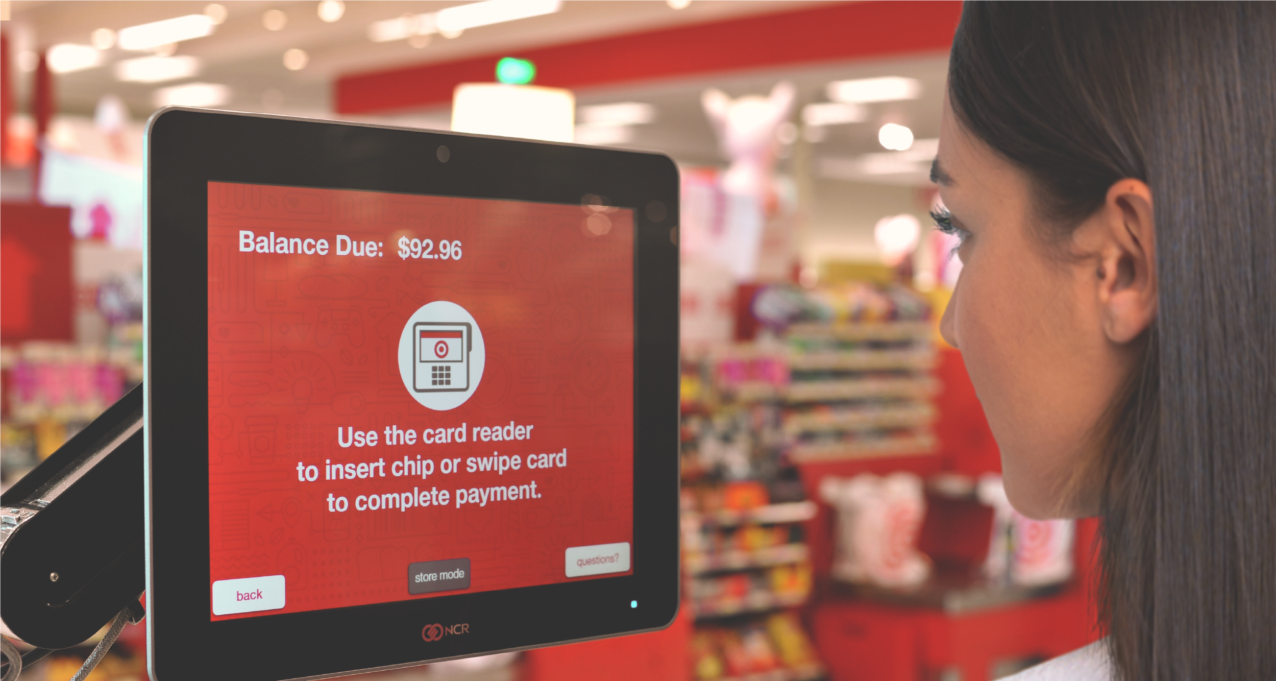
When the user tapped the “Pay” button, they were brought to a screen with payment options and the start of the final portion of the experience. Wallet scanning was later introduced into this flow.
When the user had completed the transaction, they were brought to a final screen confirming that they were finished with the experience and thanking them for shopping at Target.
This new experience had a major impact:
Net promoter score for guest checkout improved by 40% after implementation.
750m+ transactions were processed per year between 2017-2021, more transactions than any other in-store checkout experience, including front lanes.
Stability was improved by 85%, and the number of times guests needed team member intervention was significantly reduced.
Additional UX Design: Jeff Stuart
Copy Direction: Kiera Jacobson


