Milk & Midwifery
I was incredibly honored and excited to be approached to create this brand work for a midwifery practice in California. When my wife and I were pregnant, we chose to use the services of a doula and a midwife team to help guide us along our journey. It was a great comfort to know that they had us and our daughter at the center of their focus and that we could trust them with the most important moment in our lives.
When developing this identity, I wanted that sense of holistic care and personal trust to come through. Carefully crafted typography that was approachable and beautiful to represent the nature of the service. It was important that branding strike a balance of folksy and professional so that the nature of the service would feel nurturing but not too unorthodox.
Responsibilities:
Lettering
Design
Illustration
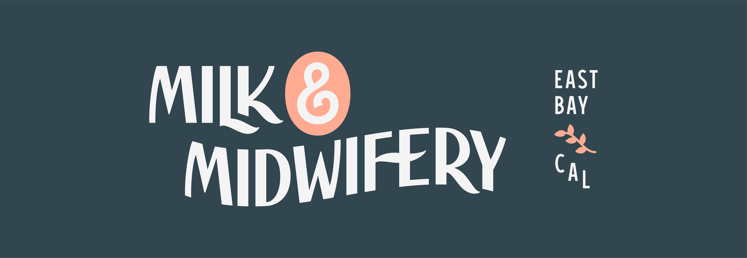
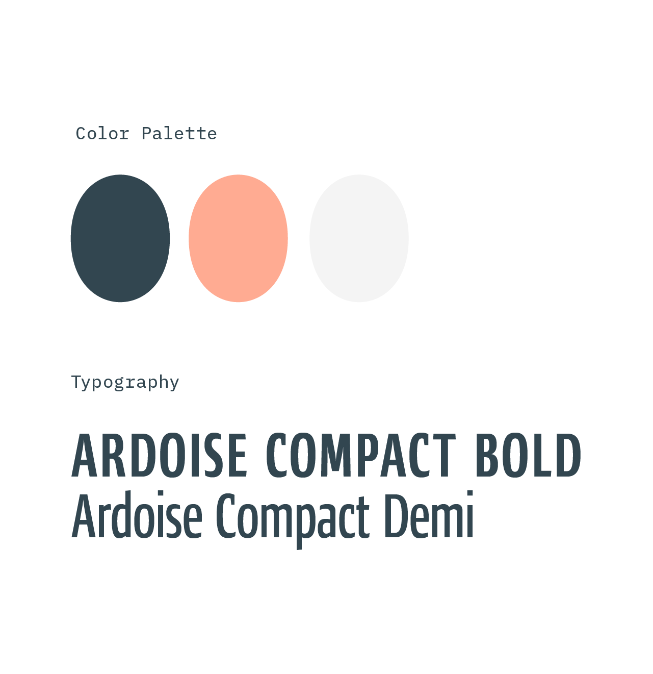
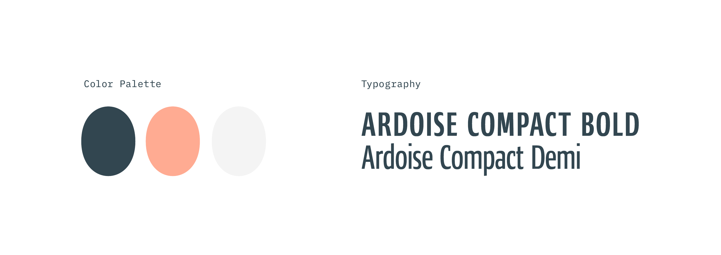
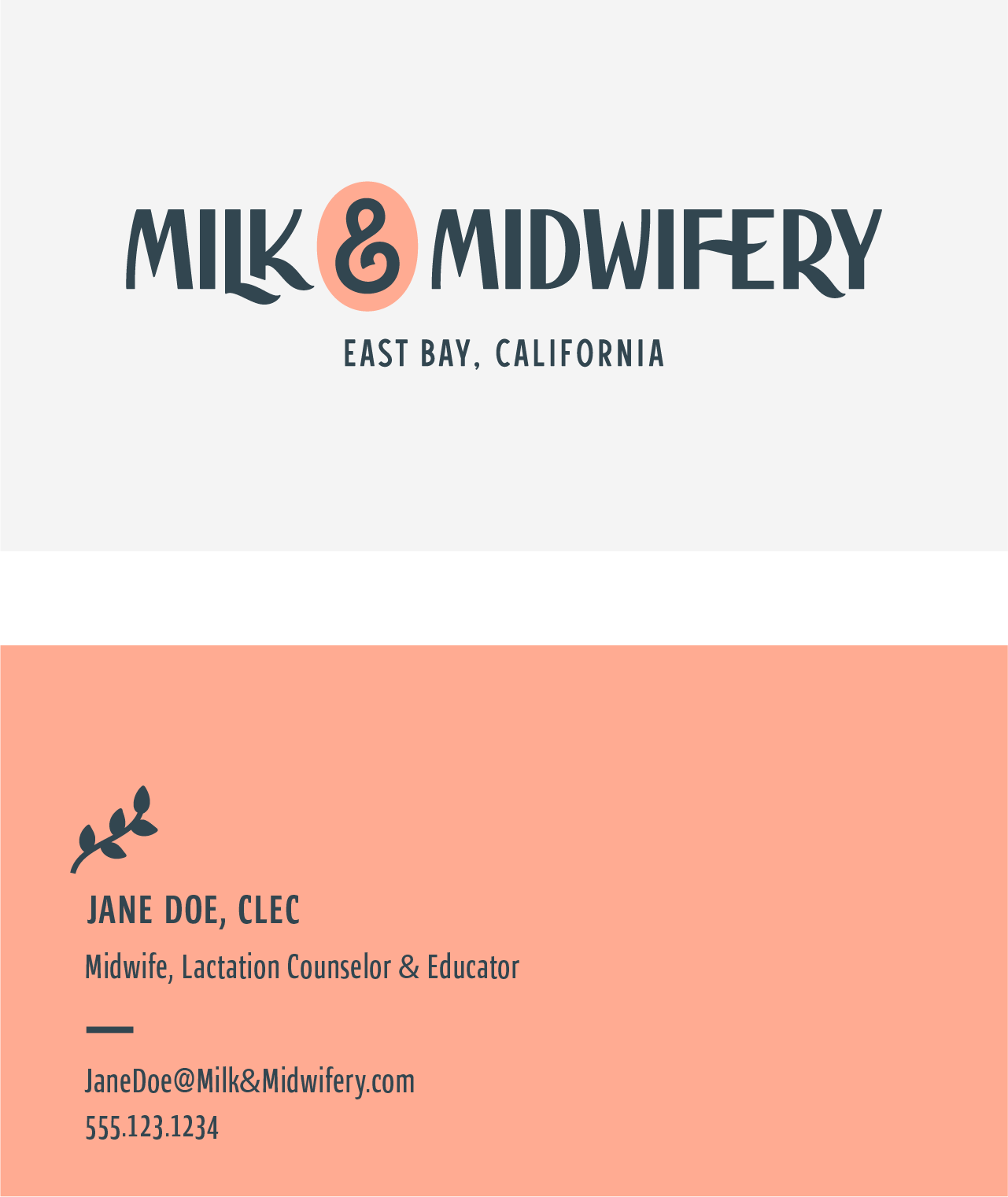
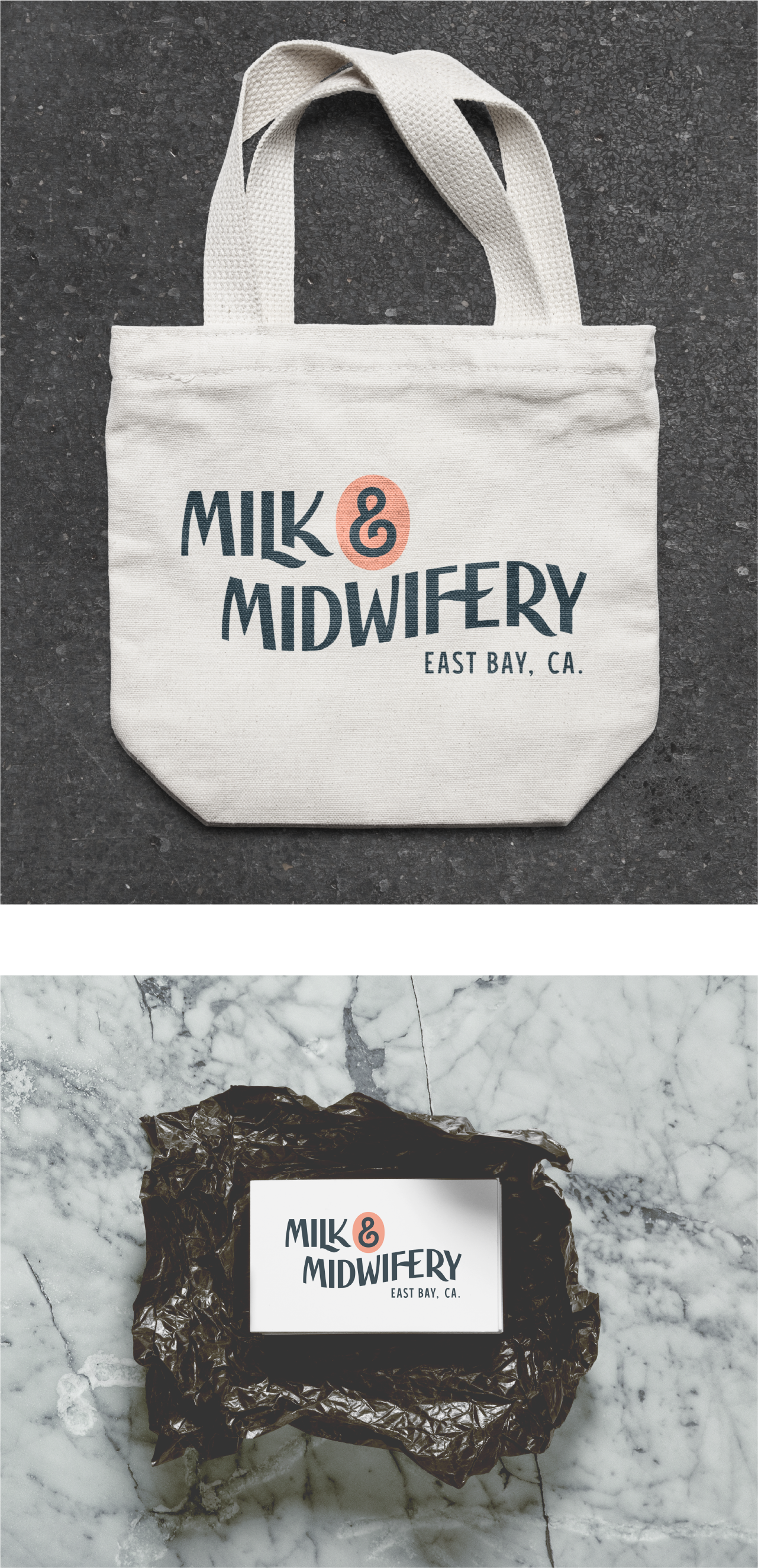
The results of our collaboration produced a beautiful set of branding assets that included variations on the primary custom logotype, a monogram, and several illustrated elements to add visual punctuation and versatility to the identity system. The mix of lettering, illustration, and color palette allows the brand to elicit a comforting, human-focused approach while at the same time reflecting the professional nature of the practice.
