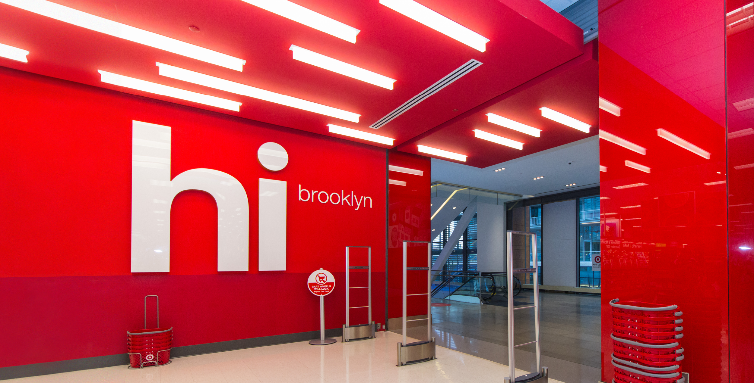
Helvetica for Target
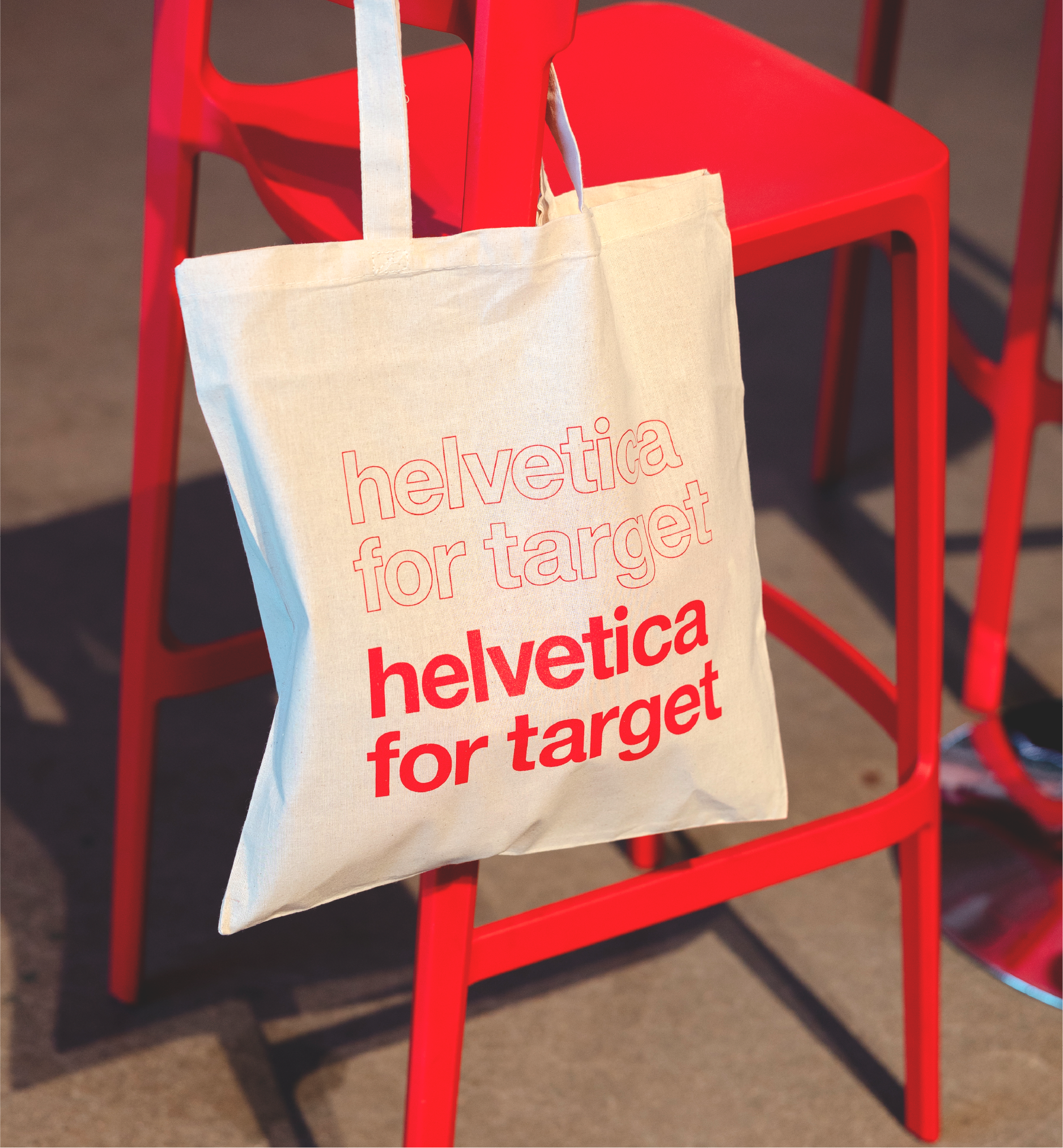
Target and Helvetica go together like peanut butter & jelly, that is to say, it’s a major part of the brand DNA. So when you’re asked to design a set of custom modifications for the creation of a branded version of the typeface for one of the universe’s biggest brands… you pinch yourself because you must be dreaming, and then you spend countless hours pouring over the minuscule details of each new character outline to craft a timeless design.
My primary responsibility was to design the major modifications to the core set of characters. This included rounded punctuation and diacritical marks, a custom lowercase bold “a,” rounded tittles on lowercase “j” & “i,” and a completely new “@” symbol. These are small details, but they make a huge impact on the visual tone of the brand.
Our internal team partnered with Monotype Foundry to implement our specific character designs into the broader set of figures. Several other changes were also made to improve the usability and versatility of each font within the typeface.
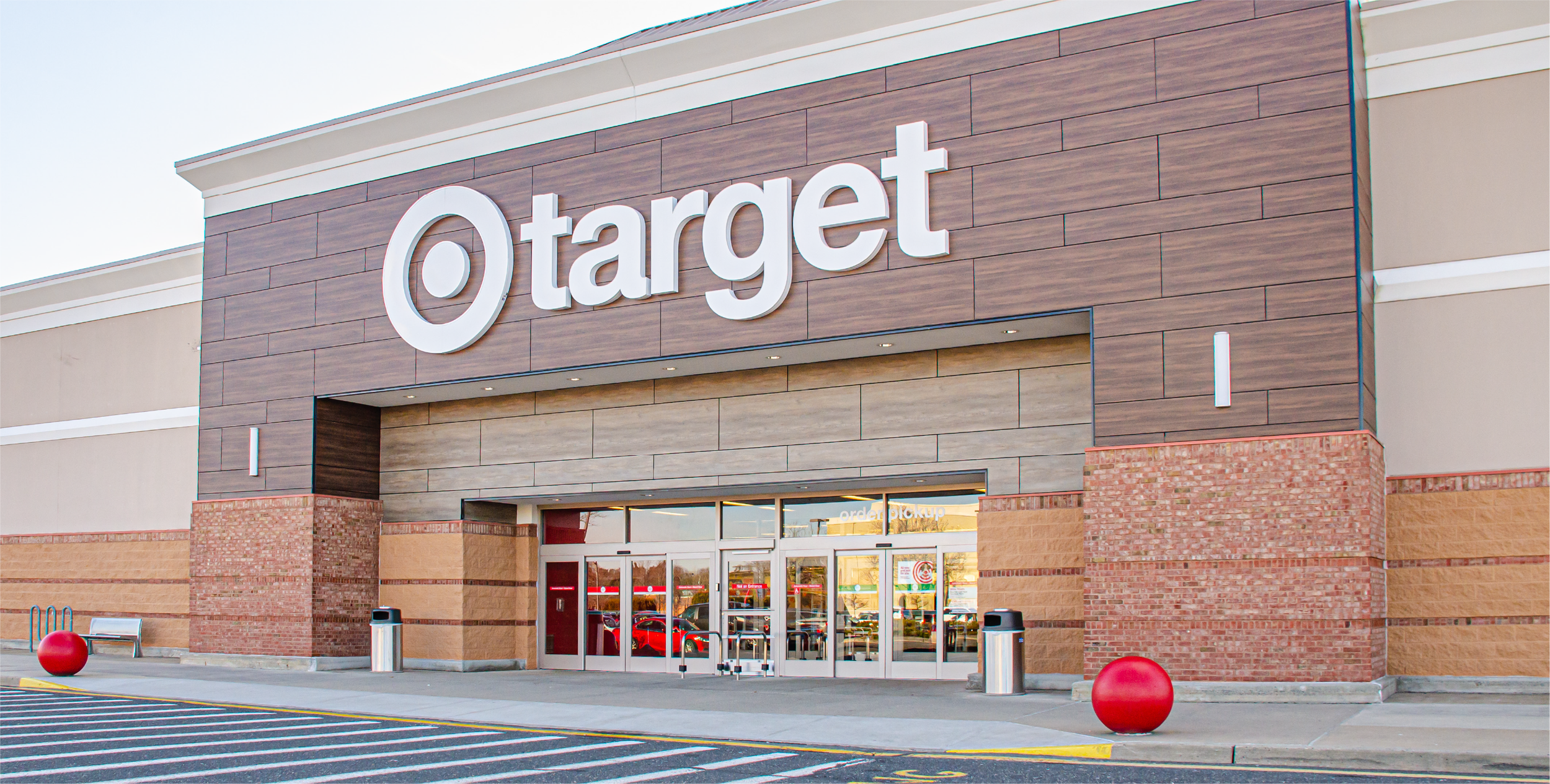
I’m incredibly humbled every time I see the huge letterforms on the exterior of the store or when it is prominently displayed in a broadcast spot. And, if I did my job well enough, my great-grandchildren may one day know how it came to be.
Responsibilities:
Character Design
Production

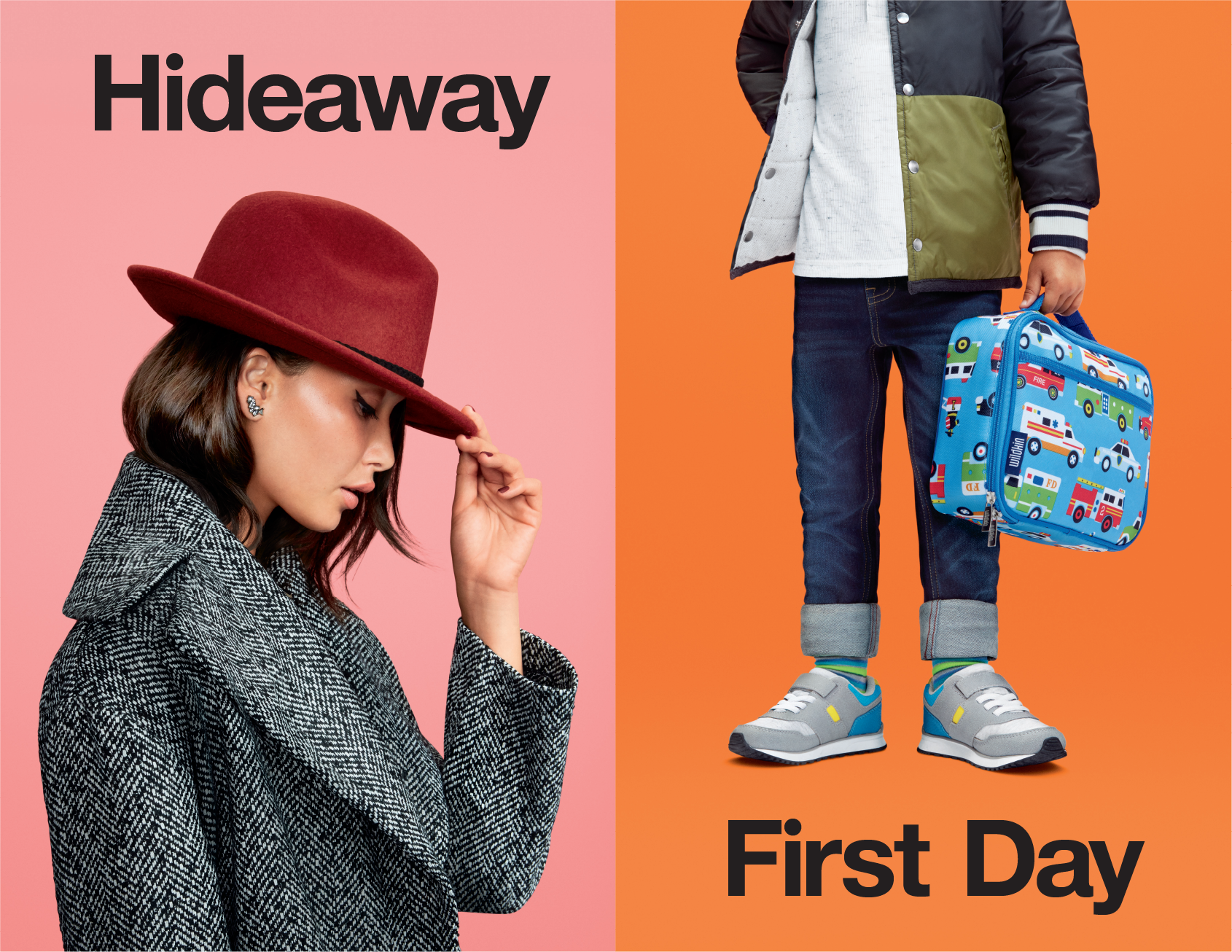
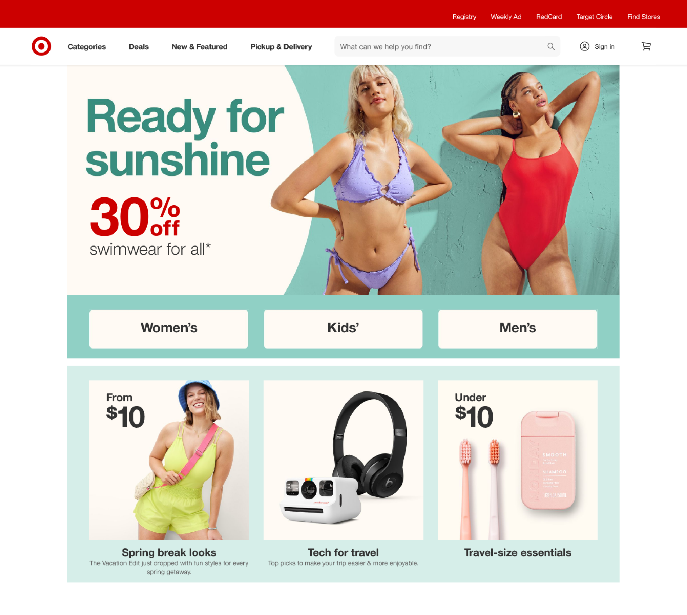
Helvetica for Target is more than just a typeface, it’s the voice of the brand in every brand expression, from anthems and campaign headlines to price callouts and product details. It feels elevated & refined at the same time, approachable & friendly, reflecting the dichotomous nature of the brand.
Creative Direction: Eric Vermilyea, Paul Wilde L’Heureux
Various Creative Applications: Target Creative


